Oh. Holy. Moly. Alan Finkel, you sly software developer. You know the way to a journal-searching, PubMed-junkied, infographic-loving, interactive-learning-crazed, Pinterest-pinning nurse’s heart don’t you?
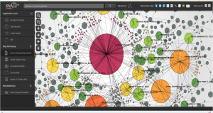
If you ever – ever – search PubMed, you should try it with the help of KNALIJ. Since my last post, Alan and the KNALIJ crew have made some amazing upgrades. For example, I had difficulty peviously sharing KNALIJ maps with others. Not anymore. Check out the one I did last night on distress in cancer patients. I can create the KNALIJ map on my iPad, tweet it, save it to Evernote for a future article or post, and pin it in addition to all the foundational tools? One of the neatest and newest features is a “Latest Citations Map,” showing the recent linkage between the topic’s body of knowledge.
Be still my heart! You might think my reaction is quite ridiculous, but not when I spend a chunk of time on PubMed. With KNALIJ, I can see several different layers of relationships and data in a visually-appealing way. We’ll take all the help we can get to make research more fun and enjoyable for others.
There’s so. much. good. stuff. within the upgraded version. You need to check it out. Seriously, if you are a student or instructor or a nurse embodying professionalism, give KNALIJ a whirl for your next article search or literature review. If you’re like me, you’ll end up dreaming up searches just to see the maps. Knowledge is power, but that is real power.
