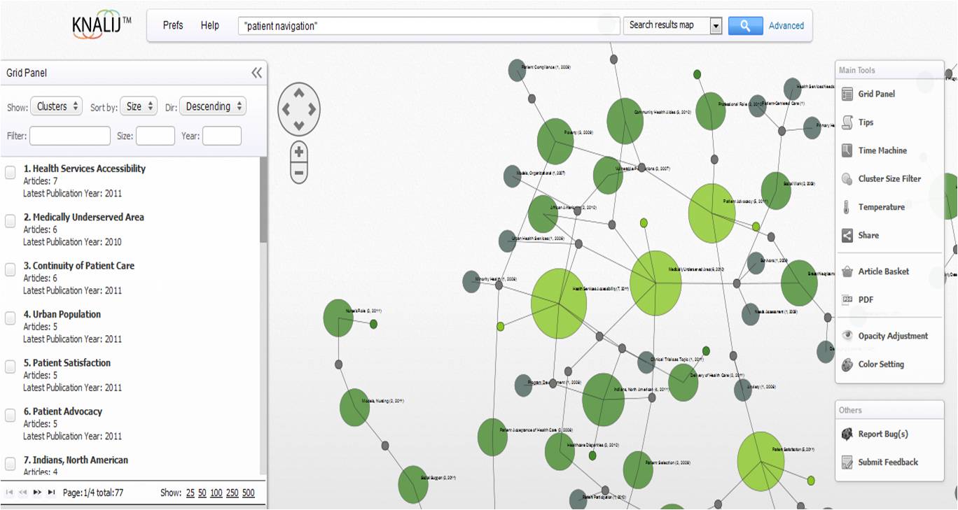
A friend turned me on to KNALIJ (pronounced “knowledge”). You know I love a good infographic or interactive data site, and of course I am becoming increasingly enamored by research, but the three together – interactive infographics of research? Be still my ridiculously nerdy heart.
KNALIJ takes all the 21 million PubMed research articles and maps them into interactive clusters for your eye-gobbling pleasure or reference needs. Need I mention KNALIJ has some pretty neat features like the “time machine” feature, which allows you to see the progression of research on your queried topic over years and decades? Oh. Yes.
This is the standard “commercial” for KNALIJ. It’s short, sweet, and to the point.
httpv://www.youtube.com/watch?v=_5Ef8KUduuo
This is a longer video (a little over six minutes) in which the co-founder of KNALIJ, Alan Finkel, presents it and the special features in action at the National Library of Medicine Innovation Awards banquet (yeah, he won one of one awards). He’s not the most captivating speaker in the world; KNALIJ’s unique features more than makes up for that, though.
httpv://www.youtube.com/watch?v=S4H20rr4JdI
Now that I’ve played with KNALIJ for a bit, I think I am addicted. I can see so many uses for this program. Sigh. Research happiness. Thank you, Alan Finkel, for KNALIJ.


